TYNT
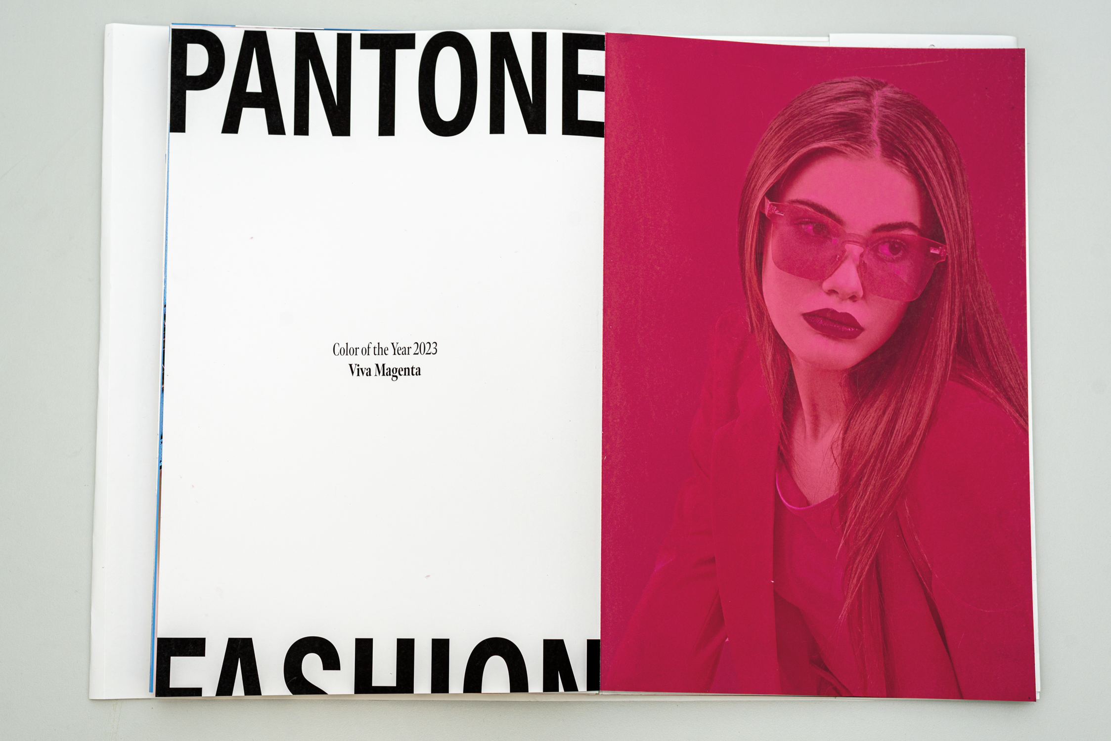
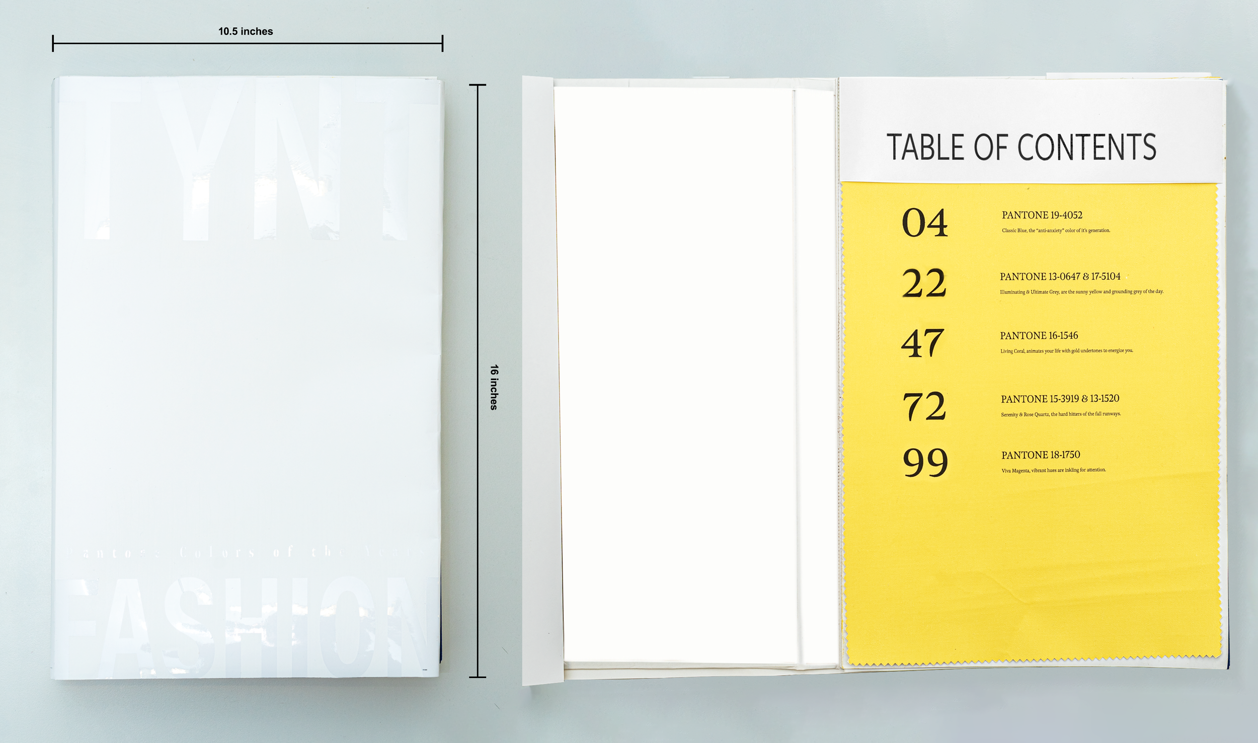
Tynt is a fashion-forward magazine that explores the impact of Pantone’s Colors of the Years on the fashion industry. This publication showcases a unique blend of bold editorial design and playful typography and imagery. Its overarching goal is to provide an experimental take on high fashion through a visually stunning coffee table magazine. Tynt is a work of art in itself, serving as a dynamic platform for fashion enthusiasts to stay up-to-date on industry trends and appreciate fashion in a new light.
INSTITUTION: Tyler School of Art and Architecture
INSTRUCTOR: Scott Laserow
ELEMENTS: Branding, Typography, Editorial, and Social Media


Research
Tynt is primarily made up of the fashion based on Pantone’s color/s of year over five different years. Deep diving into the world of Pantone was an exciting and eye opening time. In 1963, Pantone (meaning “all colors”, combining pan and tone) developed the first color matching system. Thanks to this system, graphic designers can see exactly what “yellow” would look like on paper and provide the printer with the Pantone number to make sure that they got what they wanted.
Colors
When did Pantone Color of the Year start? The Pantone Color Institute originally created the Pantone Color of the Year educational program in 1999 to engage the design community and color enthusiasts around the world in a conversation around color. The Pantone Color Institute studies color trends throughout the year in order to decide on the next Pantone Color of the Year. They take into consideration all aspects of society: fashion, marketing, social media and even politics. While only five years were chosen for this magazine, there are so many more colors that help encompass the years this educational program has continued.
Impact
TYNT's creation is a masterpiece designed to leave an indelible impression on its readers. This captivating work of art is a hidden gem, waiting to be discovered and savored. The carefully crafted exterior visuals are intentionally subtle yet alluring, evoking a sense of curiosity and intrigue. The sizable nature of the book is a testament to the depth of its contents, promising readers an exhilarating journey that will take them on an unforgettable roller coaster ride of emotions and ideas.
Framework
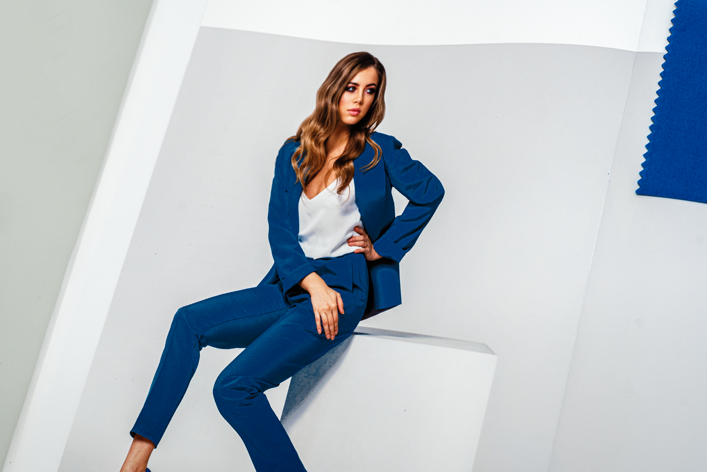
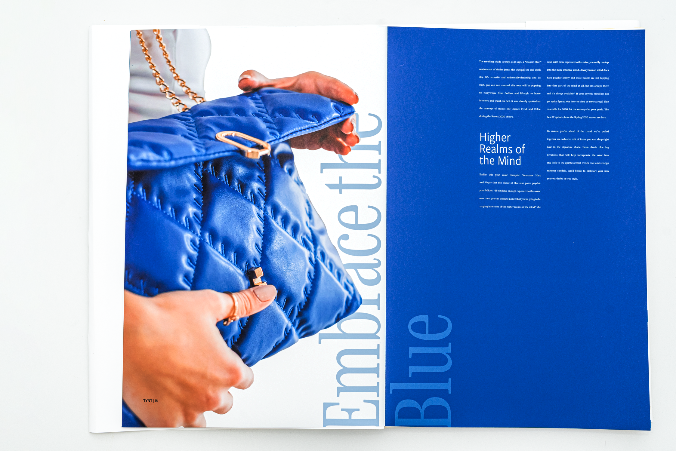
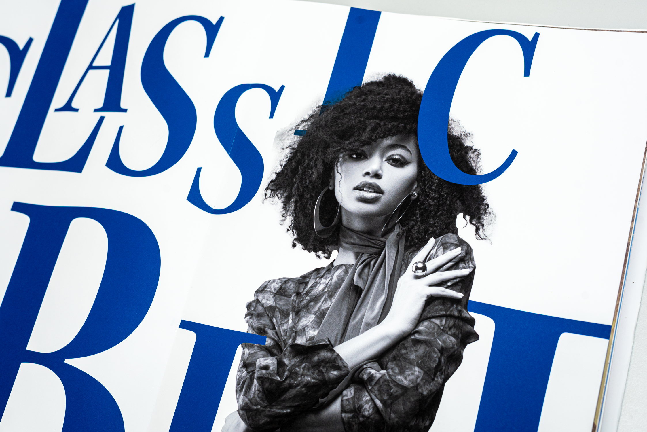
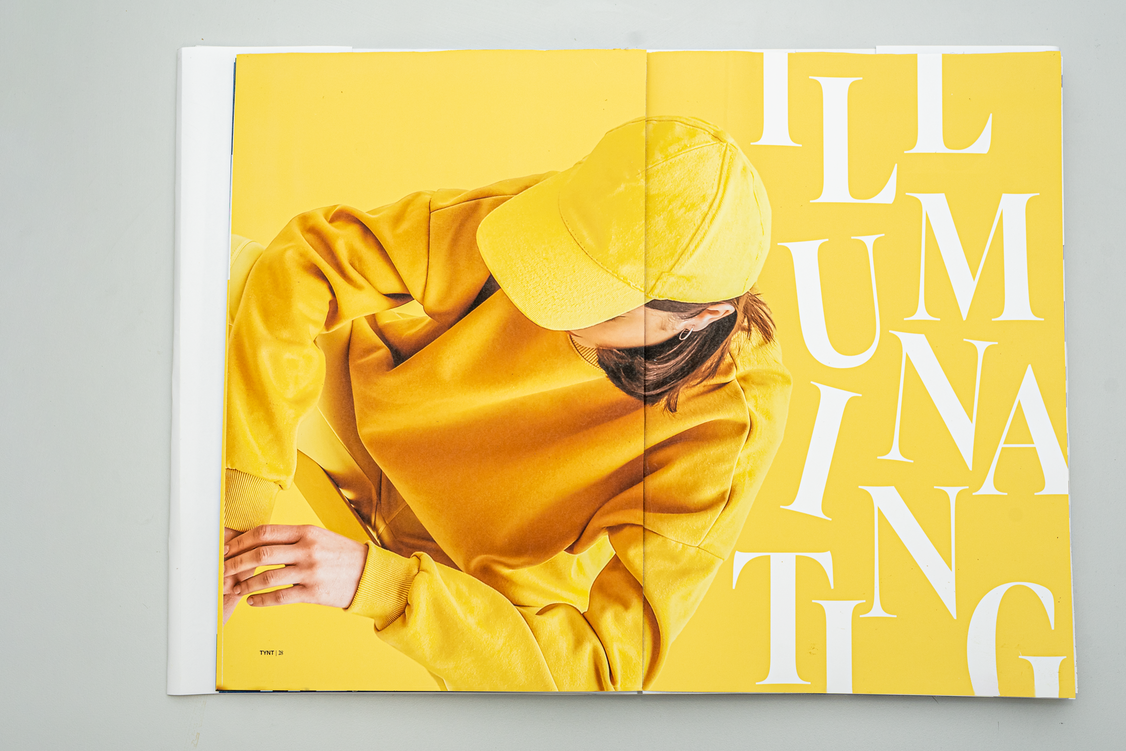
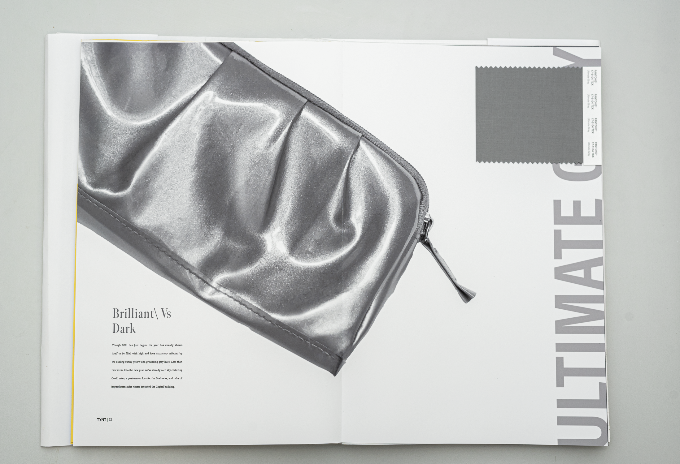
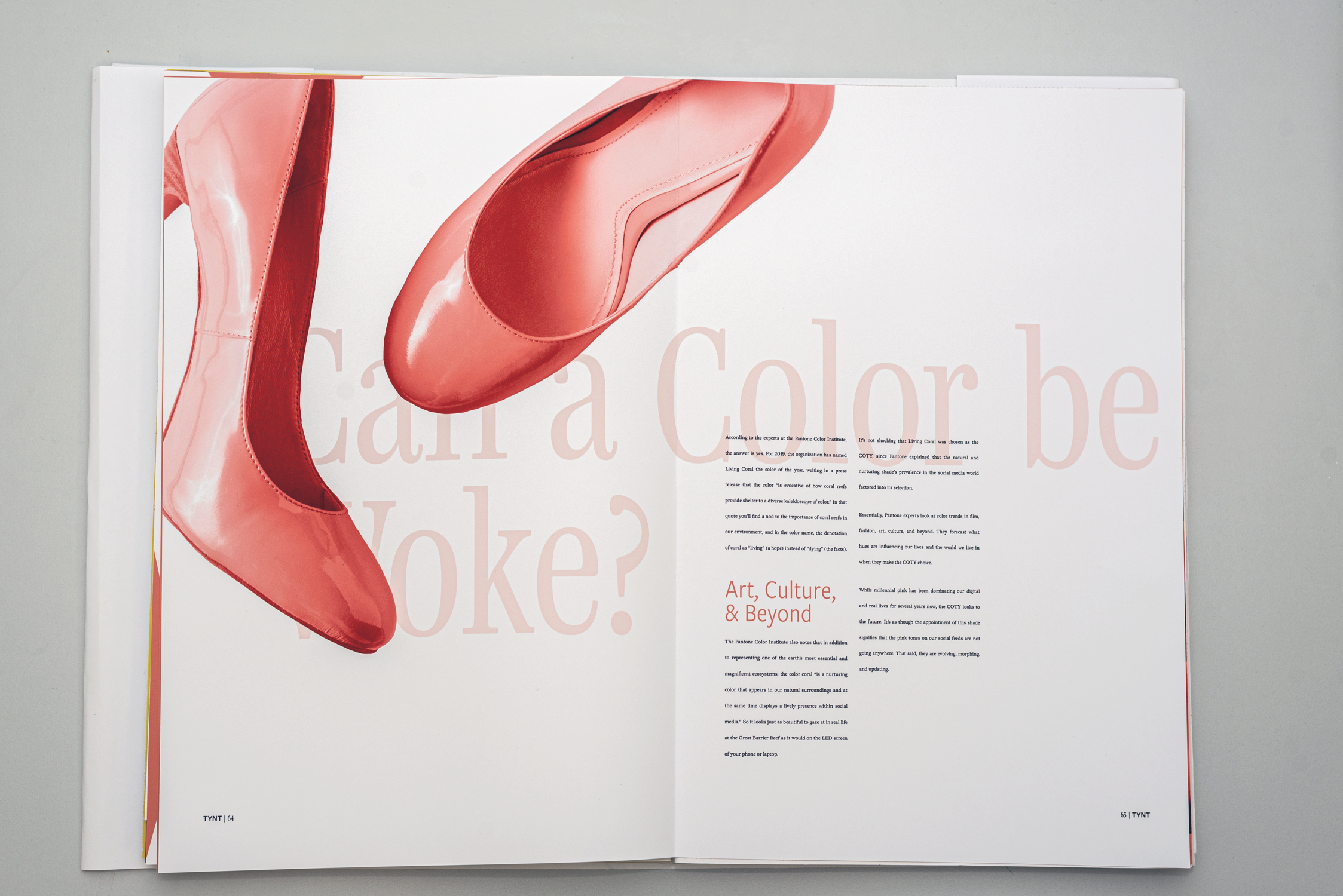
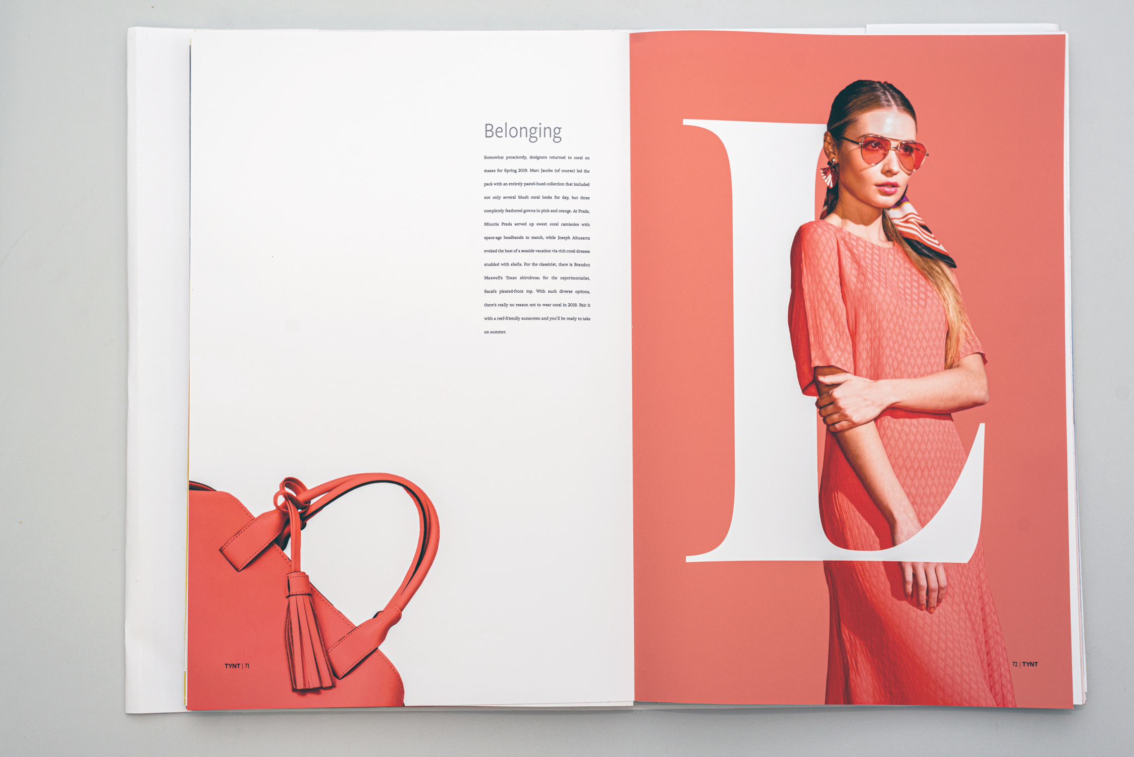
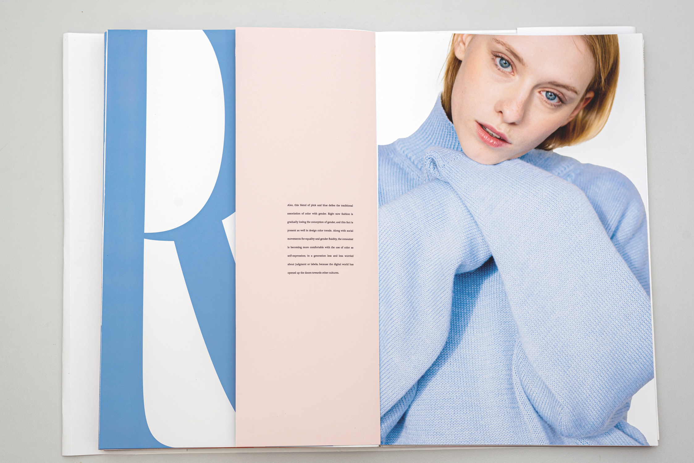
This magazine features five different articles, each focused on a specific color(s) chosen for the impact on society and fashion. Classic Blue was chosen for its ability to evoke confidence, connection, and stability in the world. Ultimate Gray and Illuminating were selected to convey a message of strength and hopefulness through a marriage of colors. Living Coral's light and lively nature represents the fusion of modern life and encourages lighthearted activity. Serenity and Rose Quartz, the first dual colors chosen by Pantone, challenge traditional color associations and reflect societal movements towards gender equality and fluidity. Finally, Viva Magenta promotes joyous and optimistic celebration, encouraging experimentation and self-expression without restraint.






Look and Feel
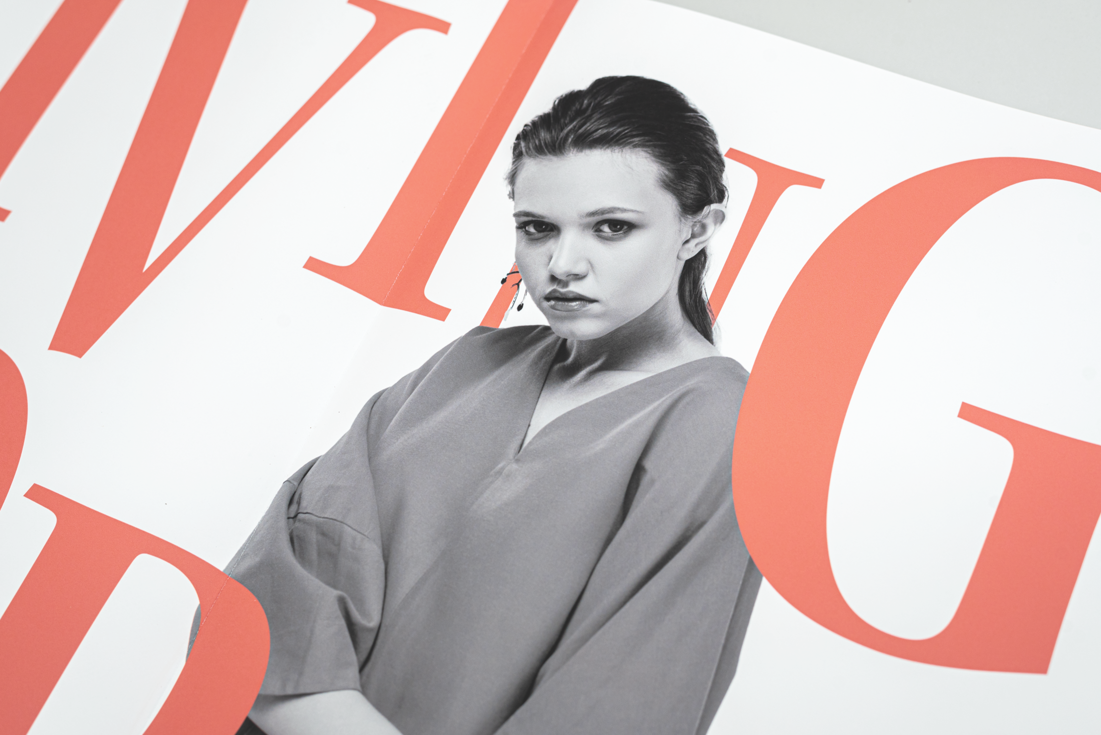
Tynt is a fashion magazine that aims to showcase the impact of Pantone's Color(s) of the Year on the fashion industry. Fashion has various presentation styles, and Tynt is a modern and experimental magazine that adopts a minimalistic approach. The magazine uses scale and white space to create an eye-catching and welcoming presentation of type and images. The visuals in Tynt are used to highlight the colors and how they were utilized in fashion.




Conclusion
In conclusion, Tynt is a unique and modern fashion magazine that focuses on emphasizing the impact of Pantone's Color(s) of the Year on the fashion industry. The magazine's minimalistic approach, combined with its experimental design, plays with scale and white space to create a striking and welcoming presentation of type and images. Tynt's visuals are strategically used to showcase the colors and how they were applied in fashion. Overall, Tynt is a visually engaging and informative magazine that offers a fresh perspective on fashion and design.
